
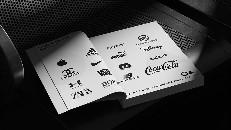
Hey there, brand builder,
You’ve invested time, energy, and passion into your business, but is your logo working as hard as you are? Whether launching a fresh brand or reimagining your current one, your logo isn’t just a visual; it’s the heartbeat of your brand’s identity. So, how do you create a logo that doesn’t just look good but also tells the right story? Let’s dive into the strategic choices you need to consider.
Contents
Wordmarks: Is Your Brand Name Strong Enough to Stand Alone?
What Makes a Wordmark Work?
Why Choose a Wordmark?
Lettermarks: Can Your Brand Be Summed Up in Just a Few Letters?
The Power of Initials
Why Choose a Lettermark?
Symbols: Does a Picture Really Say More Than Words?
Crafting the Perfect Symbol
Why Choose a Symbol?
Combination Marks: Why Choose Between a Name and a Symbol When You Can Have Both?
The Best of Both Worlds
Why Choose a Combination Mark?
Strategic Logo Design: Which Type Fits Your Brand Best?
Conclusion: Is Your Logo Ready to Work as Hard as You Do?
Strategic Logo Design for Brand Identity
Wordmarks:
Is Your Brand Name Strong Enough to Stand Alone?
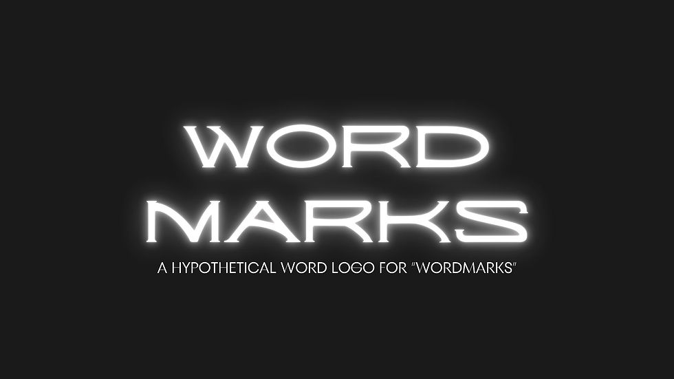
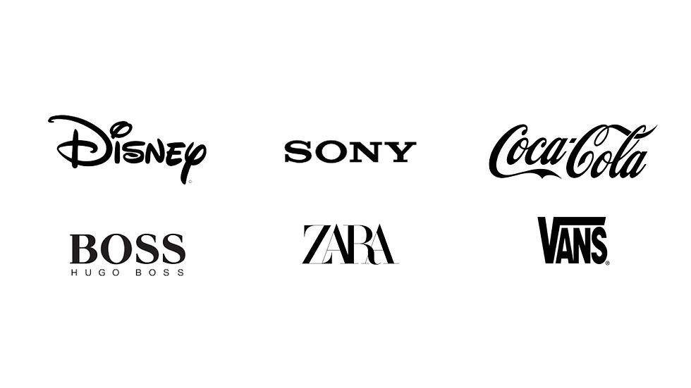
Think about Google’s clean, colorful letters or Coca-Cola’s iconic script. These logos are simple, yet they pack a punch because the brand names themselves are memorable. But here’s the secret: it’s not just about choosing any font and typing out your brand name.
What Makes a Wordmark Work?
Typography Mastery: The typeface you choose can make or break your logo. Every curve, line, and space between letters carries meaning. A serif font might convey tradition and reliability, while a sans-serif font might give off a modern, clean vibe.
Custom Tweaks: Sometimes, an off-the-shelf font isn’t enough. Customizing your typeface, like the subtle arrow hidden in the FedEx logo, adds a unique touch that sets your brand apart.
Why Choose a Wordmark?
Simplicity and Clarity: Wordmarks are straightforward. They make your brand’s name the focal point, ensuring that it’s front and center in every interaction.
Best For: Companies with short, distinctive names. If your name is catchy and memorable, a wordmark can reinforce it in the minds of your audience.
Strategic Logo Design for Brand Identity
Lettermarks:
Can Your Brand Be Summed Up in Just a Few Letters?

Now, what if your brand name is a bit long or hard to pronounce? Enter the lettermark. Brands like HBO and IBM have turned their initials into powerful symbols that are instantly recognizable.
The Power of Initials:
Simplicity: By distilling your brand name into its initials, you create a logo that’s easy to remember and visually appealing. But simplicity doesn’t mean boring—think about how much weight those few letters can carry when designed well.
Versatility: Lettermarks are compact and adaptable, perfect for social media profiles, app icons, and other small spaces where a full wordmark might not fit.
Why Choose a Lettermark?
Name Too Long?: If your brand name is lengthy, a lettermark can simplify it, making it easier for your audience to remember.
Best For: Established brands with long names or those who want a sleek, professional image.

Strategic Logo Design for Brand Identity
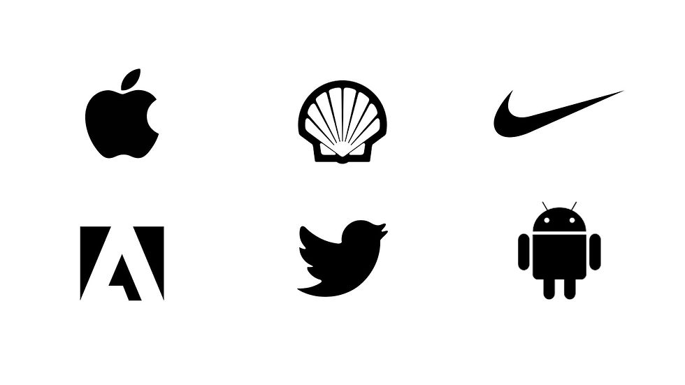
Symbols:
Does a Picture Really Say More Than Words?
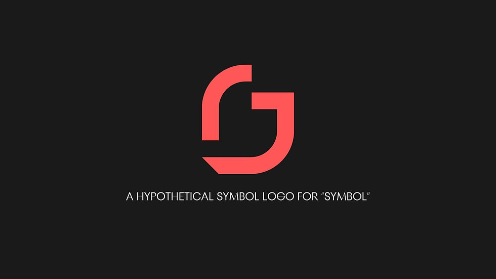
Symbols have the power to transcend language and culture, turning your logo into a universally recognizable icon. But not all symbols are created equal. The Apple logo isn’t just an apple; it’s a symbol of innovation, simplicity, and cutting-edge technology.
Crafting the Perfect Symbol:
Pictorial vs. Abstract: Pictorial logos, like the Twitter bird or the Nike swoosh, depict recognizable objects. Abstract logos, like the Pepsi circle or the Adidas stripes, use shapes and colors to convey a deeper meaning.
Emotional Impact: A well-designed symbol can evoke emotion and tell a story in a single glance. Think about what message you want your logo to send and how a symbol can encapsulate that.
Why Choose a Symbol?
Global Appeal: Symbols are especially effective for brands with international ambitions. They communicate quickly and can be easily recognized across cultures and languages.
Best For: Brands looking to create a strong, memorable visual identity that resonates worldwide.
Strategic Logo Design for Brand Identity
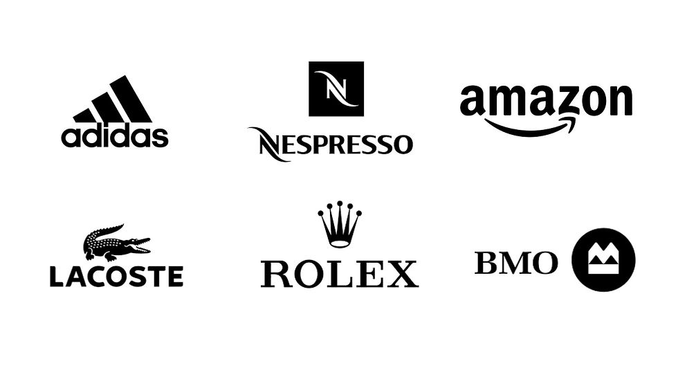
Combination Marks:
Why Choose Between a Name and a Symbol When You Can Have Both?
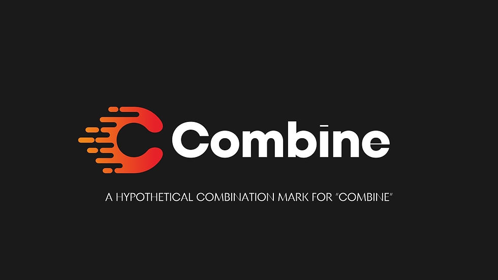
Why limit yourself to just a wordmark or a symbol? Combination marks give you the flexibility to use both, depending on where your logo appears.
The Best of Both Worlds:
Visual Wordplay: Some combination marks creatively blend the symbol and the text, like the way the Lacoste crocodile sits next to the brand name. This can add an extra layer of meaning to your logo.
Flexibility: A combination mark is versatile—you can use the text or the symbol independently when needed, or together for a unified brand presence.
Why Choose a Combination Mark?
Versatility: Combination marks are adaptable to different contexts and uses. Whether it’s a business card or a billboard, you have the flexibility to use the part of the logo that fits best.
Best For: Brands that want the recognition of a wordmark with the visual impact of a symbol.
Strategic Logo Design:
Which Type Fits Your Brand Best?
So, which logo type is right for you? That depends on your brand’s story, your audience, and your long-term goals. Here’s a quick guide to help you decide:
Are you a new brand in a crowded market? A wordmark could help build your name recognition.
Is your name long or hard to spell? Consider a lettermark for simplicity.
Do you have global ambitions? A symbol might be the way to go.
Want it all? A combination mark gives you the best of both worlds.

While we’ve delved into the strategic choices between different types of logos, it’s important to note that we haven’t touched on the color aspect of logo design in this post. Color plays a crucial role in conveying your brand’s personality and can significantly impact how your logo is perceived. We’ll explore the power of color in logo design in a future post, so stay tuned!
Conclusion:
Is Your Logo Ready to Work as Hard as You Do?
Your logo is more than just a pretty design—it’s a strategic tool that represents your brand’s identity and values. It’s the first thing your audience sees and often the first thing they remember. Whether you choose a wordmark, lettermark, symbol, or combination, make sure it’s telling the right story.
At the end of the day, the type of logo you choose should align with your brand strategy and help you achieve your goals. So, before you dive into design, take a step back and ask yourself: What story do I want my logo to tell? And how can it best serve my brand?
Ready to ensure your logo is telling the right story? Our expert branding solutions are designed to align your visual identity with your brand’s unique voice. Discover how we can help your brand stand out today."
