top of page


PROJECT OVERVIEW
Logo and Visual Theme: Whimsical Charm with a Personal Touch
Our design for Bite Bakery & Dessert features a unique handwritten logo that adds a personal, artisanal touch, emphasizing the handcrafted quality of their desserts. The playful bite mark on the letter "B" not only serves as a clever visual hook but also reinforces the brand's name and invites customers to literally "take a bite." The overall doodle style of the branding brings a sense of fun and spontaneity, appealing to dessert lovers of all ages.
OUR JOB
Brand Identity, Collateral Design


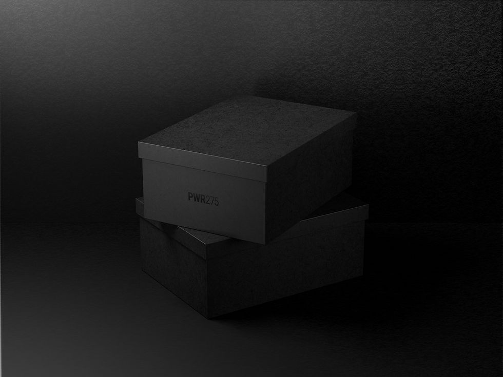
Creative and Engaging Packaging that Tells a Story
We extended the whimsical theme into the packaging design, which features lively doodle illustrations that tell a story with every package. Whether it’s a box of cookies, a bag of pastries, or a cake container, each piece of packaging is designed to delight and surprise, enhancing the unboxing experience and reflecting the playful, creative spirit of Bite Bakery & Dessert.


A Menu That Invites Exploration and Enjoyment
The menu for Bite Bakery & Dessert is crafted with the same care and creativity as their baked goods. Using the doodle style, each page is a visual treat, easy to read and enticing. The menu design not only showcases the variety of desserts available but also enhances the overall customer experience by making the act of choosing a dessert an enjoyable part of the visit.


bottom of page